
Bowtie diagrams are getting renewed attention across the process industries, and it’s easy to see why. One page shows what can cause a loss of control, what can follow from it, and which barriers stand in the way. Operators understand it, managers understand it, and a workshop can build one in an afternoon.
But a qualitative bowtie is a picture of barriers, not a measure of them.
The question a picture can’t answer
Sooner or later every bowtie meets the same question, from a plant manager, a board, or a regulator: are those barriers sufficient?
A qualitative bowtie struggles to answer it. Two barriers drawn side by side look identical whether one fails once in ten demands or once in a thousand. Counting barriers (“three on this line, two on that one”) says nothing about how often the hazard still gets through. And a likelihood read off a risk matrix trades the precision of the underlying data for a colored cell. The diagram shows that protection exists. Whether it is enough is left to the judgment of whoever is in the room.
Kenexis® Bowtie: the bowtie, with the numbers
Kenexis® Bowtie is the quantitative bowtie module of the Kenexis Integrated Safety Suite. It draws the familiar diagram: causes on the left, consequences on the right, preventive and mitigative barriers in between, and escalation factors and their controls beneath the barriers they threaten. It also carries the data that makes the diagram measurable.
Each cause carries a frequency, and each barrier carries a probability of failure on demand (PFD). From those, Kenexis® Bowtie calculates three things:
- Mitigated cause frequency: each cause’s frequency, reduced by the preventive barriers on its line.
- Top event frequency: the sum of every cause’s mitigated frequency.
- Consequence frequency: the top event frequency, reduced by the mitigative barriers on each outcome’s line.
Then it answers the question. You define the categories of harm that matter to your organization (safety, environmental, asset, or any other) and the severity levels within each, and every severity level carries a Target Mitigated Event Likelihood (TMEL). Kenexis Bowtie compares each consequence’s calculated frequency with the TMEL of the severity you selected and marks the result on the diagram: green where the outcome is tolerable, red where it is not.
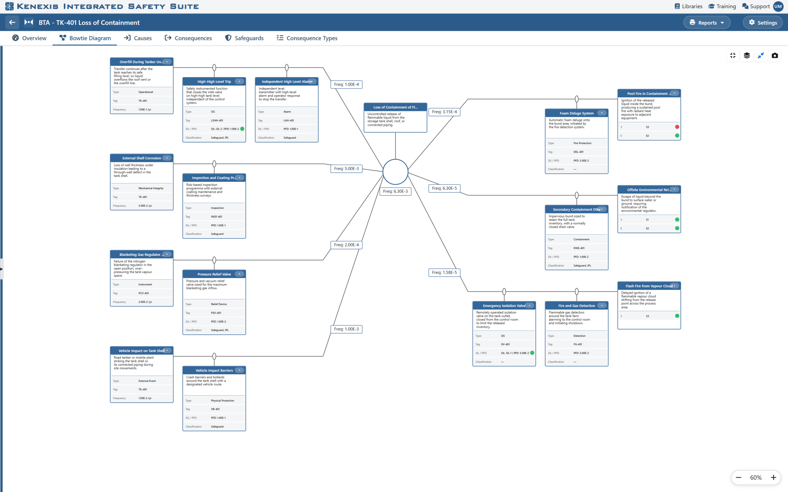
Figure 1. A quantitative bowtie in Kenexis® Bowtie. Frequency badges show each cause’s mitigated frequency, the top event frequency and each consequence frequency; the colored dots show each consequence category against its TMEL.
What the numbers give you
An answer, not an assertion. When the diagram shows green, it’s because the calculated frequency is at or below the tolerable frequency for that severity, and anyone can trace how the number was reached. When it shows red, the team knows exactly which branch needs more protection, and the study’s recommendations register records the action.
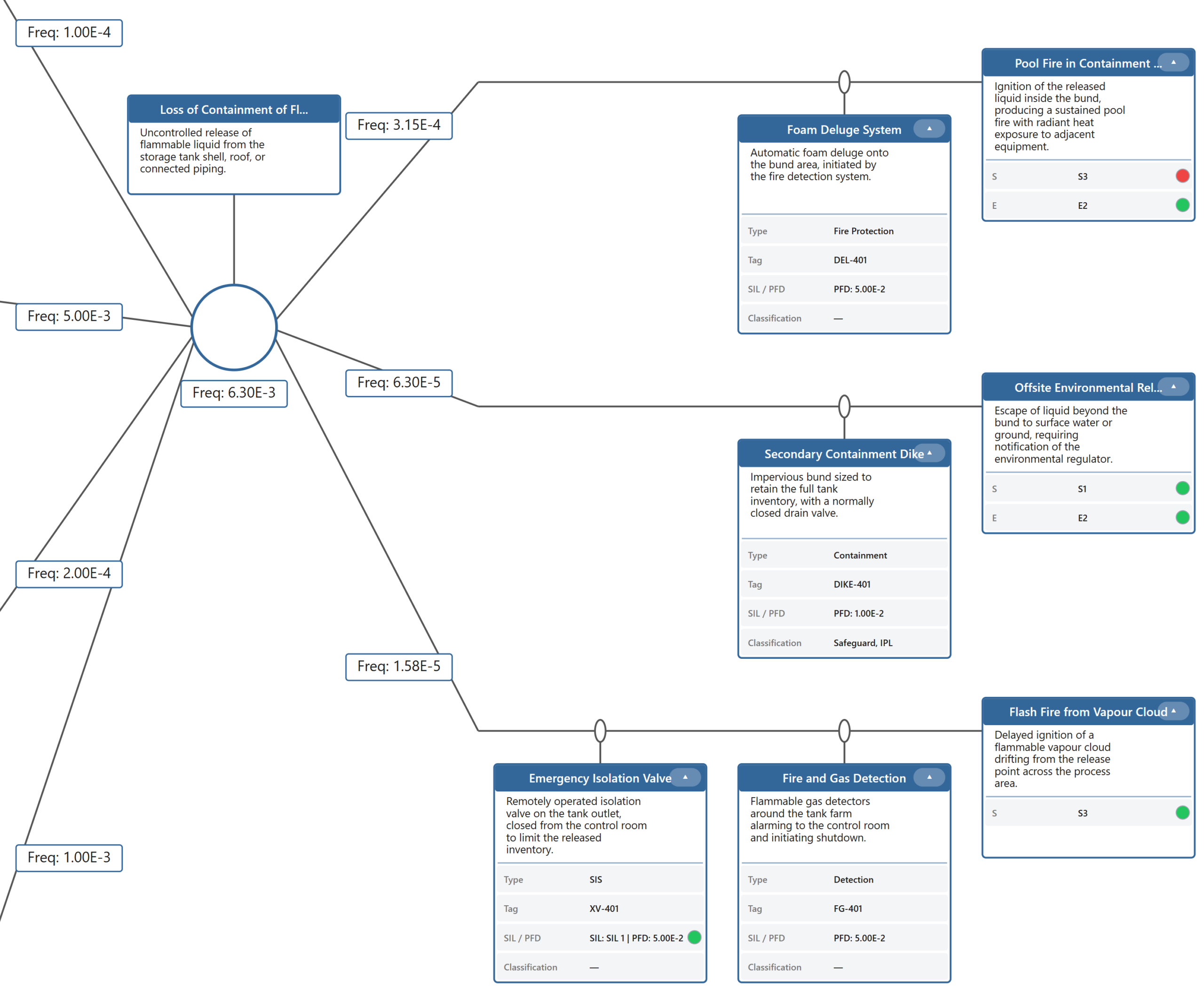
Figure 2. The consequence side up close. The top event frequency is reduced by each consequence’s mitigative barriers, and every consequence category shows green (within its TMEL) or red (above it).
Each category judged on its own terms. One outcome can be a serious safety event and a moderate environmental one. Kenexis® Bowtie keeps a severity for each category and checks each against its own criteria, so a consequence can be tolerable environmentally and intolerable for safety at the same time. The diagram shows both.
A clear view of where prevention pays. Because cause contributions add up, the top event is dominated by whichever cause has the highest mitigated frequency. That often isn’t the most frequent cause but a moderately frequent one with weak barriers. The Causes table lists entered and mitigated frequencies side by side, so the weak line stands out.
Barriers held to their claims. Where a barrier carries both a claimed safety integrity level and a PFD, Kenexis® Bowtie checks one against the other using the IEC 61511 band limits and flags any claim the data doesn’t support.
No false comfort from incomplete data. A result appears only when every value it depends on is present. A partly built study shows a blank rather than a number that understates the risk.
Always current. Every edit recalculates the study. A barrier that protects several causes is a single linked object, so when you update its PFD once, every line it protects reflects the change.
None of this costs the bowtie its communication strengths. Compact view fits a large study on one screen for a workshop. Detail rows can be switched on for a SIL-focused review or off for a management overview. The Bowtie Diagram report produces a Word document containing every bowtie in the study, and Excel reports cover the causes, consequences, barriers, and recommendations.
Bowties and PHAs, in one place
A bowtie rarely stands alone. The causes it considers and the barriers it credits usually appear in a HAZOP and a LOPA as well. In the Kenexis Integrated Safety Suite, those studies are in the same place.
- One home for the analysis. Kenexis® Bowtie studies sit in the same facility as your Kenexis® Open-PHA® studies, under the same sign-in, single sign-on, and facility permissions. Nobody has to hunt for the bowtie that goes with the HAZOP.
- One language of risk. Kenexis® Bowtie works in the terms of explicit LOPA: event frequencies, barrier probabilities of failure on demand, and a TMEL for each severity. A team that already runs LOPA in Kenexis® Open-PHA® will find the numbers familiar.
- LOPA scenarios as bowties. In Kenexis® Open-PHA®, the Premium Tools menu draws a completed LOPA scenario as a bowtie diagram, with causes and protection layers on the left and consequences on the right, and downloads it as an image for reports and presentations.
A suite behind the numbers. The figures a quantitative bowtie depends on are produced in the same suite. Cause frequencies can come from a fault tree analysis in Kenexis® Fault Tree, barrier PFDs from a SIL verification in Kenexis® SIS, and Open-PHA®‘s independent protection layers synchronize into Kenexis® SIS for that verification work.
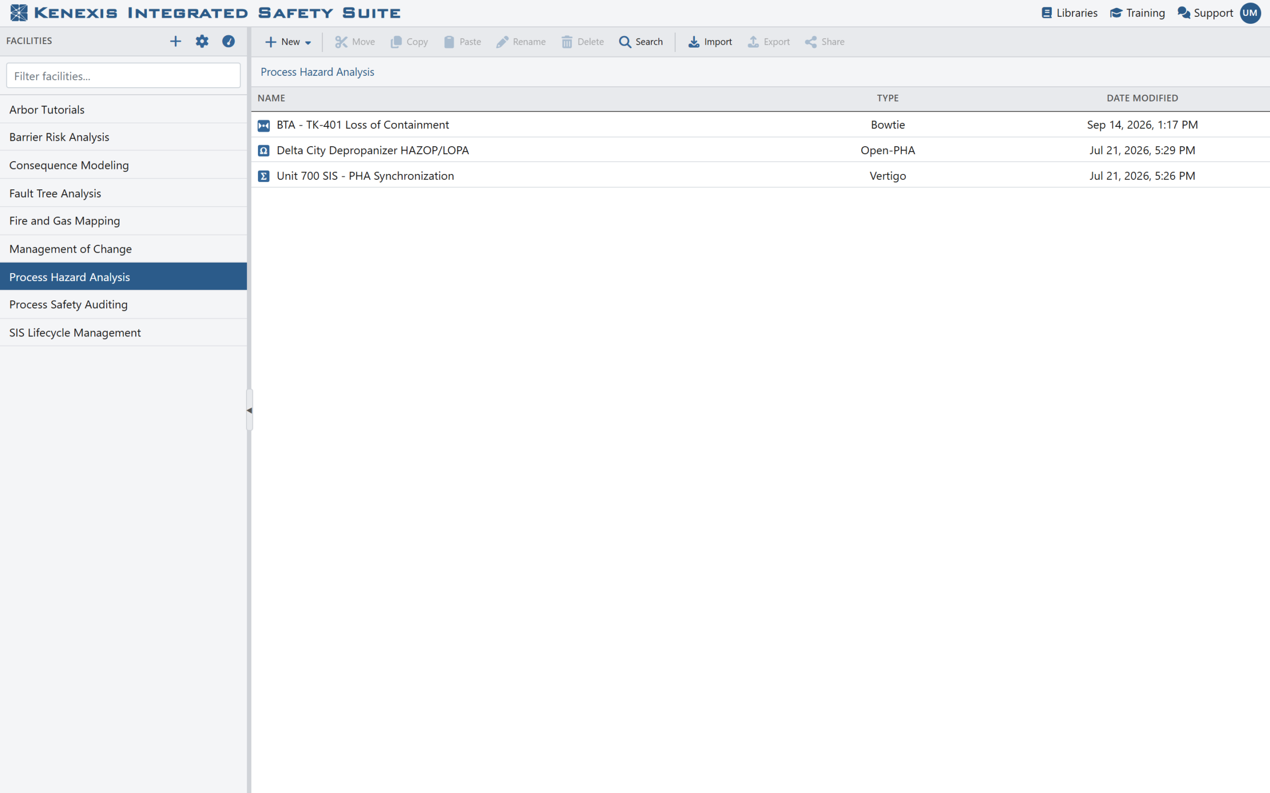
Figure 3. Kenexis® Bowtie, Kenexis® Open-PHA® and Kenexis® SIS studies side by side in one facility in the Kenexis Integrated Safety Suite Manager.
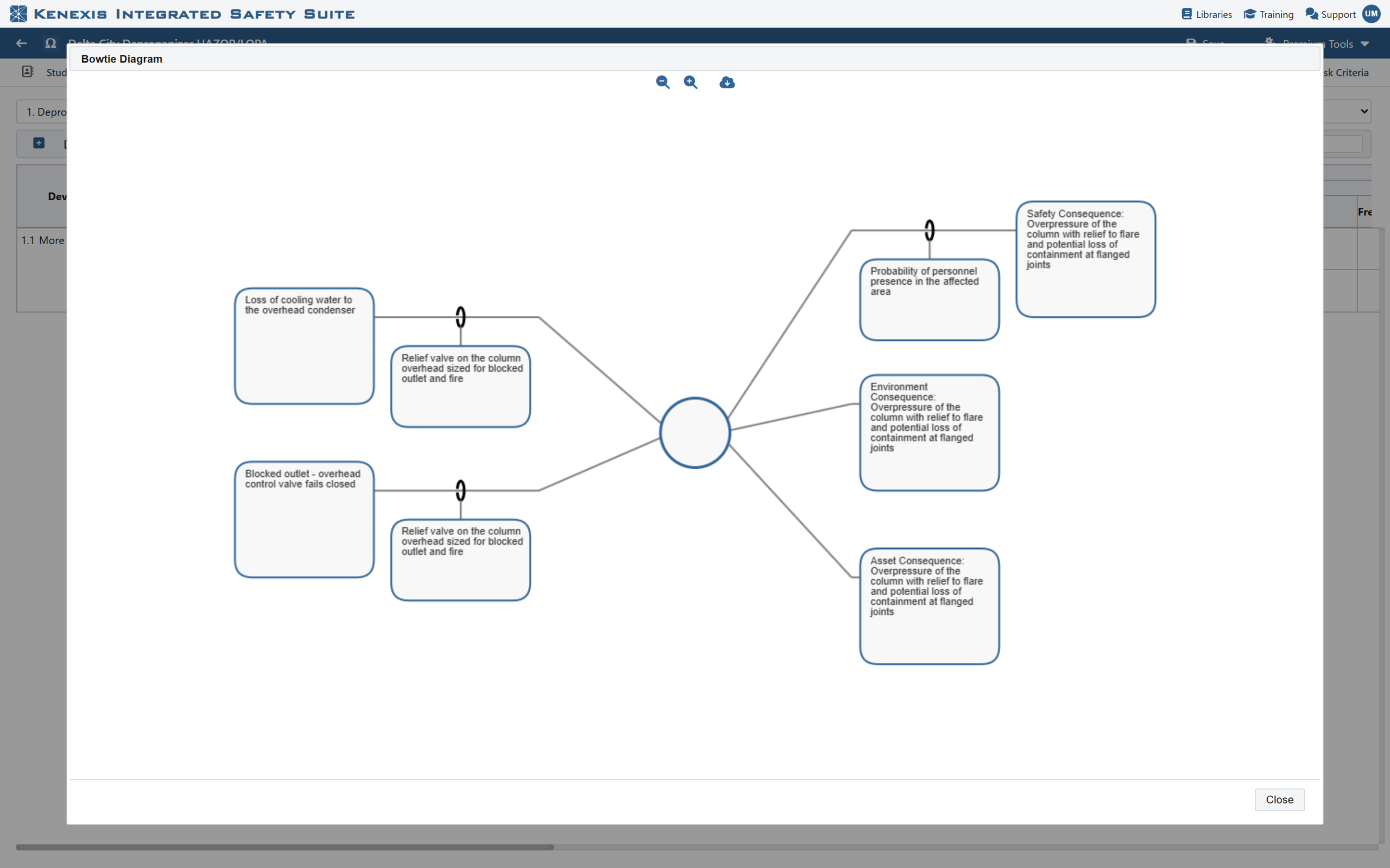
Figure 4. A Kenexis® Open-PHA® LOPA scenario drawn as a bowtie diagram from the Premium Tools menu.
The result is a risk picture that holds together. The hazard analysis, the protection layers, and the bowtie that communicates them are maintained side by side instead of in separate tools and files.
See it on your own scenarios
Kenexis is an independent engineering firm specializing in risk analysis and the integrity of instrumented safeguards, and the Kenexis Integrated Safety Suite is the platform we built to support that work. If your bowties show the barriers but not whether they’re enough, contact Kenexis for a demonstration of Kenexis® Bowtie.